
Home
  • Resumes & CVs
    Resume TemplatesView all
    Simple
    Minimal layouts that keep every recruiter focused on your content.
    Professional
    Boardroom-ready templates that spotlight experience and leadership.
    Modern
    Fresh, contemporary designs for innovative roles and companies.
    Creative
    Bold visuals and unique layouts crafted for design-forward careers.
    ATS Friendly
    Structured specifically to clear every Applicant Tracking System.
    Resume Builder
    Resume Builder
    Drag, drop, and export a job-ready resume with instant AI suggestions.
    See all resume examples
    Resume Examples
    Browse our ready-to-use resume examples and create your professional resume in minutes
  • AI Career Tools
    AI Career ToolsView all AI tools
    Keyword Optimizer
    Inject recruiter-approved keywords and rise to the top of ATS results.
    AI Resume Builder
    Generate a polished resume with AI-written bullets and proven layouts.
    Resume Translator
    Translate your resume into any language without losing nuance.
    Resume Summary
    Craft attention-grabbing summaries tailored to each role.
    Resume Bullet Point Generator
    Turn achievements into punchy bullet points in seconds.
    Cover Letter Generator
    Create pitch-perfect letters that mirror every job posting.
    Job Application Autofill
    Auto-complete repetitive application fields across top job boards.
    Resume Checker
    Audit structure, keywords, and impact with instant AI feedback.
    Resume Builder
    Resume Builder
    Drag, drop, and export a job-ready resume with instant AI suggestions.
    Chrome browser
    Firefox browser
    Opera browser
    Safari browser
    Install OwlApply Extension
    Autofill job forms, create tailored resumes, and score postings directly from Chrome.
  • Cover Letters
    Cover Letter TemplatesView all
    Simple
    Clean layouts ideal for traditional teams and entry-level roles.
    Professional
    Classic business styling that reinforces authority and credibility.
    Modern
    Sleek designs that feel right at home in tech and high-growth companies.
    Creative
    A unique canvas to showcase personality without sacrificing polish.
    Cover Letter Builder
    Cover Letter Builder
    Pair your resume with a tailored letter in minutes using guided prompts.
    Chrome browser
    Firefox browser
    Opera browser
    Safari browser
    Install OwlApply Extension
    Autofill job forms, create tailored resumes, and score postings directly from Chrome.
  • Resources
    ResourcesView all
    OwlApply Extension
    Autofill applications, generate cover letters, and track every job from your browser.
    Job Interview
    Scripts, frameworks, and confidence boosters for every interview format.
    Cover Letter
    Story-driven templates and tactics for memorable cover letters.
    Career
    Navigate negotiations, promotions, and pivots with expert advice.
    Resume
    Step-by-step guidance to craft a standout resume in any industry.
    Resume Builder
    Resume Builder
    Drag, drop, and export a job-ready resume with instant AI suggestions.
    Chrome browser
    Firefox browser
    Opera browser
    Safari browser
    Install OwlApply Extension
    Autofill job forms, create tailored resumes, and score postings directly from Chrome.
  • Pricing
EnglishBahasa IndonesiaBahasa MelayuČeštinaDanskDeutschEestiEspañolFilipinoFrançaisHrvatskiItalianoKiswahiliLatviešuLietuviųMagyarNederlandsNorskPolskiPortuguês (Brasil)Português (Portugal)RomânăSlovenčinaSlovenščinaSrpskiSuomiSvenskaTiếng ViệtTürkçeΕλληνικάБългарскиРусскийУкраїнськаעבריתالعربيةفارسیไทย日本語繁體中文한국어
My AccountBuild Resume
EnglishBahasa IndonesiaBahasa MelayuČeštinaDanskDeutschEestiEspañolFilipinoFrançaisHrvatskiItalianoKiswahiliLatviešuLietuviųMagyarNederlandsNorskPolskiPortuguês (Brasil)Português (Portugal)RomânăSlovenčinaSlovenščinaSrpskiSuomiSvenskaTiếng ViệtTürkçeΕλληνικάБългарскиРусскийУкраїнськаעבריתالعربيةفارسیไทย日本語繁體中文한국어
  • Resumes & CVs
    Simple

    Minimal layouts that keep every recruiter focused on your content.

    Professional

    Boardroom-ready templates that spotlight experience and leadership.

    Modern

    Fresh, contemporary designs for innovative roles and companies.

    Creative

    Bold visuals and unique layouts crafted for design-forward careers.

    ATS Friendly

    Structured specifically to clear every Applicant Tracking System.

    View all
  • AI Career Tools
    Keyword Optimizer

    Inject recruiter-approved keywords and rise to the top of ATS results.

    AI Resume Builder

    Generate a polished resume with AI-written bullets and proven layouts.

    Resume Translator

    Translate your resume into any language without losing nuance.

    Resume Summary

    Craft attention-grabbing summaries tailored to each role.

    Resume Bullet Point Generator

    Turn achievements into punchy bullet points in seconds.

    Cover Letter Generator

    Create pitch-perfect letters that mirror every job posting.

    Job Application Autofill

    Auto-complete repetitive application fields across top job boards.

    Resume Checker

    Audit structure, keywords, and impact with instant AI feedback.

    View all AI tools
  • Cover Letters
    Simple

    Clean layouts ideal for traditional teams and entry-level roles.

    Professional

    Classic business styling that reinforces authority and credibility.

    Modern

    Sleek designs that feel right at home in tech and high-growth companies.

    Creative

    A unique canvas to showcase personality without sacrificing polish.

    View all
  • Resources
    OwlApply Extension

    Autofill applications, generate cover letters, and track every job from your browser.

    Job Interview

    Scripts, frameworks, and confidence boosters for every interview format.

    Cover Letter

    Story-driven templates and tactics for memorable cover letters.

    Career

    Navigate negotiations, promotions, and pivots with expert advice.

    Resume

    Step-by-step guidance to craft a standout resume in any industry.

    View all
  • Pricing
My AccountBuild Resume
  1. Home
  2. Blog
  3. Resume
  4. Best Font for a Résumé: What 3,313 Real Files Showed
Tufan Yavas
Written by Tufan Yavas

Best Font for a Résumé: What 3,313 Real Files Showed

Check My Résumé
Last updated: September 26, 2026
12 minute read
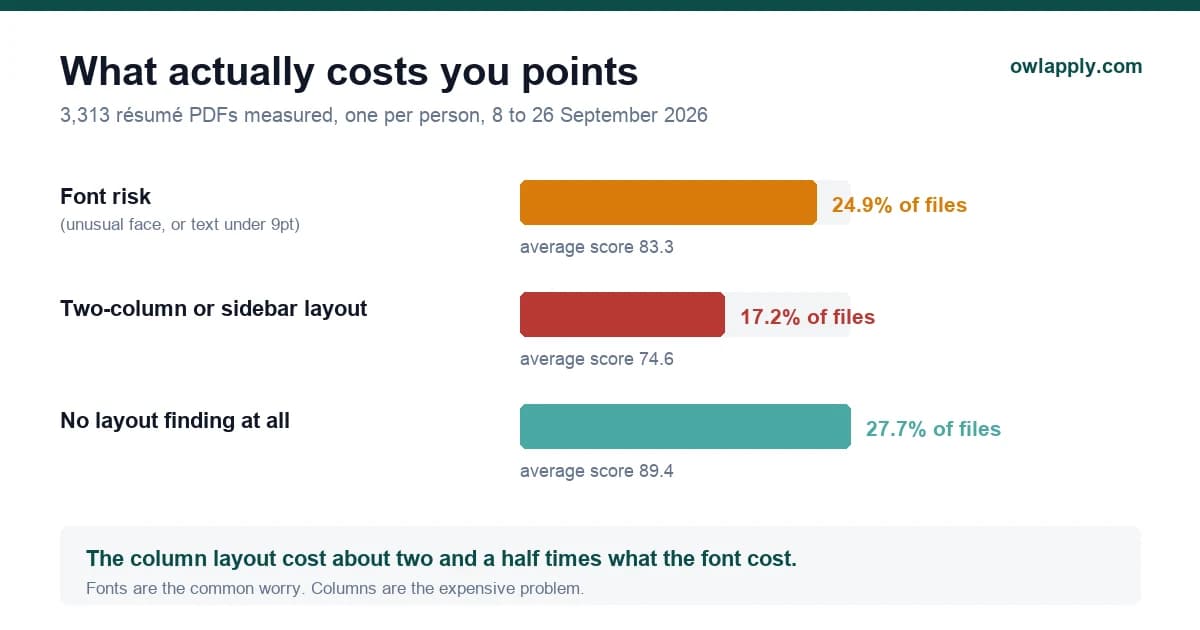
Chart comparing how often font problems and two-column layouts appeared in 3,313 résumé PDFs, and what each cost in score
  • The fonts that are safe, and why
  • What font size should a résumé be?
  • The fonts that actually get flagged, from real files
  • Arial or Calibri? And is Times New Roman finished?
  • •Arial or Calibri
  • •Is Times New Roman outdated?
  • •Serif or sans serif
  • What the font is not responsible for
  • How to check your own file in one minute, with no tool
  • How we measured this
  • Résumé fonts: the questions people ask
  • •What is the best font for a résumé?
  • •What font size should a résumé be?
  • •Is 8.5pt too small for a résumé?
  • •Is Arial or Calibri better for a résumé?
  • •Is Times New Roman a good font for a résumé?
  • •Does the font really affect whether a tracking system reads my résumé?
  • •Can I use two fonts on a résumé?
  • •What font should I use in Google Docs?
  • •Should I use a font from Canva or a template site?
  • •What about résumés in Arabic, Thai or other non-Latin scripts?

The short answer: use Arial, Calibri, Aptos, Helvetica, Georgia, Cambria, Garamond, Verdana or Times New Roman, set body text at 10 to 12 points, and use one family throughout. Any of those will parse cleanly and look professional.

The longer answer is more useful, because the font is rarely the thing costing you interviews. We run a free résumé checker, and between 8 September and 26 September 2026 it inspected 3,313 PDF résumés at the file level: the actual fonts embedded in the document, the point sizes, the column geometry. This article is what that sample shows, including the parts that contradict the usual advice.

Measured on 3,313 PDF résumés, 8 to 26 September 2026

24.9%
carried a font risk finding (unusual or non-embedded face, or body text under 9pt)
15.2%
were flagged for type size alone, against 11.0% for the typeface itself
about 6 points
average score gap between files with a font finding and files without
17.2%
used a two-column or sidebar layout, which cost those files about 15 points

Read those three numbers together and you have the real hierarchy. A font problem is common but cheap. A column problem is less common and three times as expensive. Most guides get this backwards.

The fonts that are safe, and why

A parser does not have taste. It does not care whether your typeface is elegant. Two things can actually go wrong, and both are mechanical:

  • Substitution. If the face is not embedded in the PDF, the machine opening it picks a replacement. Glyph widths shift, lines rewrap, and text that sat in a tidy column can collide with the column beside it.
  • Extraction threshold. Text below roughly 9 points sits near the size floor some extractors use, so it can be dropped or misread.
  • Character mapping. Decorative and symbol faces sometimes ship a broken map, so the letters look right on screen and come out as nonsense when copied.

Everything else about a typeface is a human judgement, not a machine one. That is why the safe list is longer than the nine names most articles repeat.

FontTypeWhy it is safeWatch out for
ArialSans serifInstalled on every operating system, never substitutedVery common, so it reads as neutral rather than considered
CalibriSans serifMicrosoft default from 2007 to 2024, embeds cleanlySlightly small at a given point size, so 11pt reads like 10pt
AptosSans serifMicrosoft's default since 2024, replaces CalibriNewer, so older Office installs may substitute it
HelveticaSans serifCore PDF font, present in every readerOn Windows it is often silently swapped for Arial, which is harmless
GeorgiaSerifDesigned for screens, wide and readable at small sizesRuns large, so 10pt is usually enough
CambriaSerifMade for print and screen, narrow enough to save a lineCan feel formal for creative roles
GaramondSerifCompact, buys you space when you are just over a pageRuns small, do not go below 11pt
VerdanaSans serifVery wide letterforms, the most legible at small sizesWide means long, it can push you onto a second page
Times New RomanSerifUniversally available, parses perfectlyReads as a default rather than a choice
Expert tip
Metric compatible clones are safe too, and this is worth knowing if you write in Google Docs. Docs does not have Arial, it has Arimo, an Arial clone with identical letter widths. Same for Tinos in place of Times New Roman, Carlito in place of Calibri and Caladea in place of Cambria. The letters are drawn from a different file but they occupy exactly the same space, so nothing shifts and nothing is flagged.
OwlApply Team
Career Development Platform•OwlApply

What font size should a résumé be?

Body text at 10 to 12 points. Below 10 you are making a reader work; below 9 you are inside the range where extraction gets unreliable. Above 12 the document starts to look padded.

ElementSizeNote
Your name16 to 22ptOne clear step above everything else, no need to shout
Section headings12 to 14ptBold is enough, you do not need a size jump and bold and colour
Job titles and employers11 to 12ptSame as body or one point up, bold carries the hierarchy
Body text and bullets10 to 12ptPick one and hold it across the whole document
Dates and locations10 to 11ptNever smaller than the body text by more than one point

Here is the split that matters, and we have not seen it published anywhere. Of the 24.9% of files carrying a font finding, 15.2% of all files were flagged for type size and only 11.0% for the typeface. The larger group has nothing to do with font choice: it is text set under 9 points, usually in a sidebar, a footer or a dense skills strip where someone was fighting to stay on one page. 939 of the small-text samples we recorded were at 8pt and 231 at 7pt, with a tail below that. If you are shrinking type to fit, cut a bullet instead. A résumé that is 90% as complete and fully readable beats one that is complete and half extracted.

The one page rule, honestly

  • •Under ten years of experience, one page is a reasonable target but not a law.
  • •Two clean pages parse better than one page set at 8.5pt with quarter inch margins.
  • •If you are one or two lines over, switch to Garamond or Cambria before you touch the point size. They are narrower at the same size.
  • •Margins below 0.5 inch push content into the header and footer band, which some parsers skip entirely.

The fonts that actually get flagged, from real files

These are the families that most often triggered a font risk finding in the 3,313 file sample, after removing the metric compatible clones described above. The counts are small in absolute terms, which is itself the point: no single typeface dominates, because these are template defaults rather than choices.

FamilyWhere it usually comes from
DM SansGoogle Fonts, the default in many design-tool templates
GaretTemplate marketplace font
AlegreyaGoogle Fonts serif, popular in academic templates
AileronFree Helvetica alternative bundled with templates
GothamLicensed brand font, common in designer-made templates
Public SansOpen-source US government typeface
BarlowGoogle Fonts grotesque, common in modern templates
Canva SansCanva's own default face
Glacial IndifferenceCanva template staple
VazirmatnPersian and Arabic script face, bundled with regional templates

Notice what these have in common. Not one of them is unprofessional. Not one is Comic Sans. They are the default faces that graphic design tools hand you, and they get flagged for the boring reason that they are unusual enough to risk substitution, not because they look wrong. If you built your résumé in a design tool and never chose a font, this is the list you probably picked from without knowing it.

The practical version

If your résumé came out of a design tool, the font is the least of your worries but it is the easiest thing to fix. Change the family to one from the safe table, re-export, and you have removed the risk in about thirty seconds. If you would rather start from a layout that is already single column, the ATS friendly templates are built that way. Then go look at whether the template put your contact details in a sidebar, because that is the expensive problem.

Arial or Calibri? And is Times New Roman finished?

These are the two questions people actually type, so here is a direct answer to each.

Arial or Calibri

Neither is better for parsing. Both are embedded, both are universal, both extract perfectly. The difference is visual and it is small. Arial is wider and reads as plainer. Calibri is narrower with softly rounded corners, so it fits more words per line and feels slightly warmer. If you are tight on space, Calibri. If you want maximum neutrality, Arial. Nobody has ever been rejected over this choice.

Is Times New Roman outdated?

It parses flawlessly and it always will. The objection to it is taste, not function: it is the default of a word processor from decades ago, so to some readers it signals that no decision was made. That matters more in design, marketing and startup roles than it does in law, academia, government or finance, where it still reads as entirely normal. If you like it, keep it. If you want the same reliability without the association, Georgia and Cambria are serif faces that were designed later and look it.

Serif or sans serif

There is no parsing difference. Serif faces have small strokes on the letter ends, sans serif faces do not. Print traditions favour serif, screen traditions favour sans serif, and a résumé is read on a screen more often than on paper now. Choose the one you find easier to read at 11pt and stop thinking about it. What does matter is using one family. Two families is a design decision that needs a reason; three is noise.

What the font is not responsible for

Here is the perspective the guides miss. In our sample the files with a font finding scored 83.3 on average, against 89.4 for files with no file level finding at all. That is a gap of about six points. The files with a two-column or sidebar layout scored 74.6, a gap of about fifteen.

So the column decision cost roughly two and a half times what the font decision cost, and it is the decision most template driven résumés get wrong without realising. A sidebar looks organised to a human and reads as one interleaved stream to a machine, which is how a skills list ends up glued to the middle of a job description. The reverse chronological layout avoids the problem entirely.

Do this

  • One column, top to bottom, in reading order
  • One font family, 10 to 12pt body text, embedded in the export
  • Contact details in the first lines of the body, not in the header band
  • Standard section names: Experience, Education, Skills, Projects
  • Export as a text based PDF from a word processor or a résumé builder

Avoid this

  • A sidebar holding your skills, languages or contact details
  • Body text under 9pt to win back a line
  • Two or three font families mixed for visual interest
  • Skill rating bars and icons, which are images and extract as nothing
  • Exporting from a design tool as a flattened or image based PDF

How to check your own file in one minute, with no tool

You do not need software to catch most of this. Open your PDF, press select all, copy, and paste into a plain text editor or an empty email. What you see is close to what an extractor sees.

What to look for in the pasted text

  • Is every word there, in the order you wrote it?
  • Do your dates sit next to the right job, or have they drifted to the bottom?
  • Did your skills list land in the middle of an unrelated paragraph? That is a column problem.
  • Are there strange characters where 'fi' or 'ff' should be? That is a ligature or mapping problem.
  • Is your email address and phone number present? If they are missing they were probably in the header band.
  • Did anything vanish completely? Images and text boxes extract as nothing.

If the paste looks right, your file is fine and the font is not your problem. If it looks scrambled, the layout is the cause far more often than the typeface.

See exactly which fonts your résumé uses

Upload your PDF and the free checker lists every file level finding, including the font families it found, the point sizes and the extracted text. No account.

Check my résumé

How we measured this

Every number here comes from public checks run through our own résumé checker between 8 and 26 September 2026: 3,313 PDF files that the layout analyser was able to inspect, counting each person's first upload only. We report counts across the whole set and never look at an individual résumé.

Two caveats we would want to read in someone else's research. First, this is a sample of people who chose to check a résumé, so it likely over-represents job seekers who already suspect something is wrong. Second, the window is deliberately short and recent: the detectors behind these findings were revised on 8 September 2026, and every figure here comes from the revised set rather than from an average across two different tools.

Résumé fonts: the questions people ask

What is the best font for a résumé?
Arial, Calibri, Aptos, Helvetica, Georgia, Cambria, Garamond, Verdana and Times New Roman are all safe. They are installed everywhere, they embed cleanly in a PDF and they extract without error. The choice between them is aesthetic, not technical.
What font size should a résumé be?
Body text at 10 to 12 points, your name at 16 to 22, section headings at 12 to 14. Do not go below 10pt for body text, and never below 9pt, where some extractors start dropping text.
Is 8.5pt too small for a résumé?
Yes. It is below the point where extraction becomes unreliable and it is hard to read on a phone, which is where a lot of first passes happen. If you are shrinking type to fit, remove a bullet instead.
Is Arial or Calibri better for a résumé?
Neither parses better. Calibri is narrower so it fits more per line, Arial is wider and more neutral. Pick on space and taste.
Is Times New Roman a good font for a résumé?
Technically it is perfect and always will be. The only objection is that it reads as a default rather than a choice, which matters in design and startup roles and not at all in law, academia, government or finance.
Does the font really affect whether a tracking system reads my résumé?
Less than people think, and less than the size you set it at. In 3,313 files a font finding was worth about six points of score. A two-column layout was worth about fifteen. Fix the columns first, then make sure nothing is under 9pt.
Can I use two fonts on a résumé?
You can, and it parses fine, but it rarely helps. One family with bold for hierarchy is cleaner and harder to get wrong. If you do use two, use one for headings and one for body, never more.
What font should I use in Google Docs?
Arial, Times New Roman, Georgia or Verdana are all available and all safe. Docs substitutes metric compatible clones behind the scenes, which occupy identical space and cause no problem.
Should I use a font from Canva or a template site?
Check it first. Canva Sans, Glacial Indifference, DM Sans, Garet and Questrial were among the most flagged families in our sample, not because they look unprofessional but because they are unusual enough to risk substitution. Swapping to a font from the safe list takes seconds.
What about résumés in Arabic, Thai or other non-Latin scripts?
The same rules apply, but use a system font for that script rather than a downloaded display face, and make sure it is embedded. Substitution is more damaging in scripts where letters join, because a replacement face may not carry the same shaping.
Share article

Launch your resume in 15 minutes

Pick a proven layout, let AI suggest winning bullet points, and export a polished resume before your coffee cools.

Build my resume

Launch your resume in 15 minutes

Pick a proven layout, let AI suggest winning bullet points, and export a polished resume before your coffee cools.

Build my resume

Connect with OwlApply

Follow on LinkedInWatch on YouTubePin on PinterestJoin us on InstagramLike on FacebookFollow on XFollow on MediumFollow on TikTok
Build Resume
EnglishBahasa IndonesiaBahasa MelayuČeštinaDanskDeutschEestiEspañolFilipinoFrançaisHrvatskiItalianoKiswahiliLatviešuLietuviųMagyarNederlandsNorskPolskiPortuguês (Brasil)Português (Portugal)RomânăSlovenčinaSlovenščinaSrpskiSuomiSvenskaTiếng ViệtTürkçeΕλληνικάБългарскиРусскийУкраїнськаעבריתالعربيةفارسیไทย日本語繁體中文한국어

JOB SEEKERS

  • Build Resume
  • Resume Examples
  • Resume Templates
  • Cover Letter Templates
  • Job Search Helper
  • Job Tracker

CAREER RESOURCES

  • Resume Help
  • Job Interview
  • Career
  • Cover Letter
  • OwlApply Extension
  • Blog

AI TOOLS

  • Cover Letter Builder
  • AI Resume Optimizer
  • Job Application Autofill
  • AI Resume Builder
  • ATS Resume Checker
  • All AI Tools

SUPPORT

  • Pricing
  • FAQ
  • Contact Us
  • Terms of Service
  • Privacy Policy
  • Cookie Policy
  • Right of Withdrawal

Copyright 2026 OwlApply. All rights reserved.

Launched on Fazier